
Accessible Carousel & Slider gives the WordPress block editor two accessibility-first blocks — a hero carousel / slider and a native card scroller — built to WCAG Level AA. Use it as an accessible carousel, slider, or slideshow that is fully keyboard-operable, screen-reader friendly, and responsive, with an always-visible pause control and no forced autoplay. Both are real Gutenberg blocks with ready-made patterns you can insert and edit, and nothing is hidden from assistive technology. If you run WooCommerce, a Featured Products block (and a matching [ananyoo_featured_products] shortcode) can pull the products you have marked Featured straight into either accessible layout — the card scroller or the hero carousel — with real titles, alt text, prices and a WCAG-safe category badge, no API key or configuration. The block adds per-element toggles, a description length limit, colour controls and a live in-editor contrast check.
Live demo: Try the accessible carousel & slider demo »
New in this version
- Featured Products block (new in 2.9.0): show your WooCommerce Featured products in either accessible layout — the card scroller or the hero carousel — and choose exactly what appears. Toggle the image, category badge, title, short description, price and “View” link on or off; set the description length in words; pick the order and how many to show; and choose the badge colour as Auto (always WCAG-safe) or Custom with a live contrast check that verifies your colour on the spot (WCAG 1.4.3). A matching
[ananyoo_featured_products]shortcode is included for quick drop-in use. No API key, no configuration; existing blocks are unchanged. - An in-editor Accessibility check with a live WCAG colour-contrast pass/fail readout for every colour pair, plus alt-text, heading and button-text checks — so you catch problems while you build.
- Full keyboard control: Left/Right arrow keys change slides and Home/End jump to the first/last slide.
- Slide changes are announced by title to screen readers, not just “Item 2 of 5”.
- Choose dots or a titled tab list for slide navigation, a visible slide counter, and a “Skip carousel” link.
- Reading-time pacing for autoplay so a slide is never advanced before it can be read (autoplay stays off by default).
- Optional, off-by-default visitor modes: a “View as list” reading mode and a dyslexia-friendly reading toggle.
- Windows High Contrast (forced-colors) support throughout.
Hero carousel (built to the W3C/WAI Carousels tutorial): each slide has a background image and a solid “contrast box” holding a heading, a paragraph, and an optional button, placed left, right, or bottom. The solid box guarantees readable text contrast over any image. No autoplay by default; when enabled, a configurable pause/stop control is always shown.
Card scroller: a native CSS scroll-snap row of cards. Because it uses real browser scrolling, it works with the keyboard, touch, the scrollbar, and screen readers with no JavaScript — and nothing is hidden from assistive technology, avoiding the focusable-but-hidden trap common to multi-slide carousels. “Cards per view” is pure CSS (it steps down to 2 then 1 on smaller screens), and there is no autoplay.
Patterns: insert ready-made layouts (hero overlay, hero card, autoplay showcase, minimal, features row, services row) from the Accessible Carousel category, then edit freely. To save your own configured layout as a template, use WordPress’s built-in “Create pattern” on the block toolbar.
Carousel accessibility features
- Carousel is a labelled region containing a semantic list of slides; with JavaScript off it degrades to a readable list.
- Controls are real buttons, fully keyboard operable, with no keyboard trap.
- Keyboard focus is never moved by next/previous or by auto-advance.
- A polite live region announces the new slide by title (e.g. “Slide 2 of 5: …”) on user-initiated changes; auto-rotation stays silent so it does not interrupt screen reader users.
- Full keyboard control: Left/Right arrow keys change slides and Home/End jump to the first/last slide, in addition to the on-screen buttons.
- A visible “2 / 5” slide-position indicator, plus an in-editor Accessibility check that flags weak colour contrast, missing alt text and vague button text as you build.
- Choose dots or a titled tab-list for slide navigation, and a “Skip carousel” link (WCAG 2.4.1) for keyboard users.
- Optional, off-by-default visitor modes: a “View as list” reading mode and a dyslexia-friendly reading toggle.
- No autoplay by default; when enabled, a stop/start control is always provided (WCAG 2.2.2), rotation pauses on hover and focus, and reading-time pacing can give each slide enough time to be read.
- Transition animations (fade or slide) are disabled automatically under prefers-reduced-motion.
- Background images are decorative by default, with a real alt-text option when the image is meaningful.
- Solid contrast box, 44px control targets, and a high-visibility focus indicator.
Card scroller accessibility features
- Native CSS scroll-snap: keyboard, touch, scrollbar, and screen readers all work with no JavaScript.
- The scroll region is itself keyboard-focusable and labelled, so it can be scrolled with the arrow keys.
- Cards are a real list; nothing is set to aria-hidden, so there is no focusable-but-hidden content.
- Each card link carries hidden context (e.g. “Learn more – Design”) so repeated links have distinct names (WCAG 2.4.4).
- No autoplay. Optional previous/next buttons are added only when the cards overflow, so there are never dead controls.
- “Cards per view” is responsive by CSS (desktop value, capped at 2 on tablet and 1 on mobile).
Links
- Plugin home & documentation
- Live demo
- More accessibility plugins from Ananyoo — further WordPress accessibility plugins are in active development.
- Support & contact
Privacy
This plugin collects no data, contacts no external services, and adds no front-end links.
Screenshots

The hero carousel and card scroller in the editor, with their design controls in the sidebar.

The "Choose a layout" picker shown when you insert a block — Editorial, Soft, Minimal, or Start blank, each with a thumbnail.

The six bundled patterns in the "Accessible Carousel" category of the inserter.

A front-end hero carousel: a labelled region with prev/next, dots, and an always-present pause control when autoplay is on.

A front-end card scroller: a native scroll-snap row of cards, keyboard and screen-reader friendly.

The in-editor Accessibility check: live WCAG colour-contrast pass/fail for each colour pair, plus alt-text and heading checks, shown as you build a slide.

New front-end options: a titled tab navigation, a visible "2 / 5" slide counter, a "Skip carousel" link, and the optional "View as list" and "Easier reading" visitor toggles.

The plugin's own accessible "How to use" admin page: a keyboard- and screen-reader-friendly help screen with a visible focus ring, semantic headings and contrast-checked colours.

The block-editor sidebar for the carousel: choose dots or a titled tab list, reading-time pacing, and the optional "View as list" and dyslexia-friendly reading toggles under "Accessibility options".
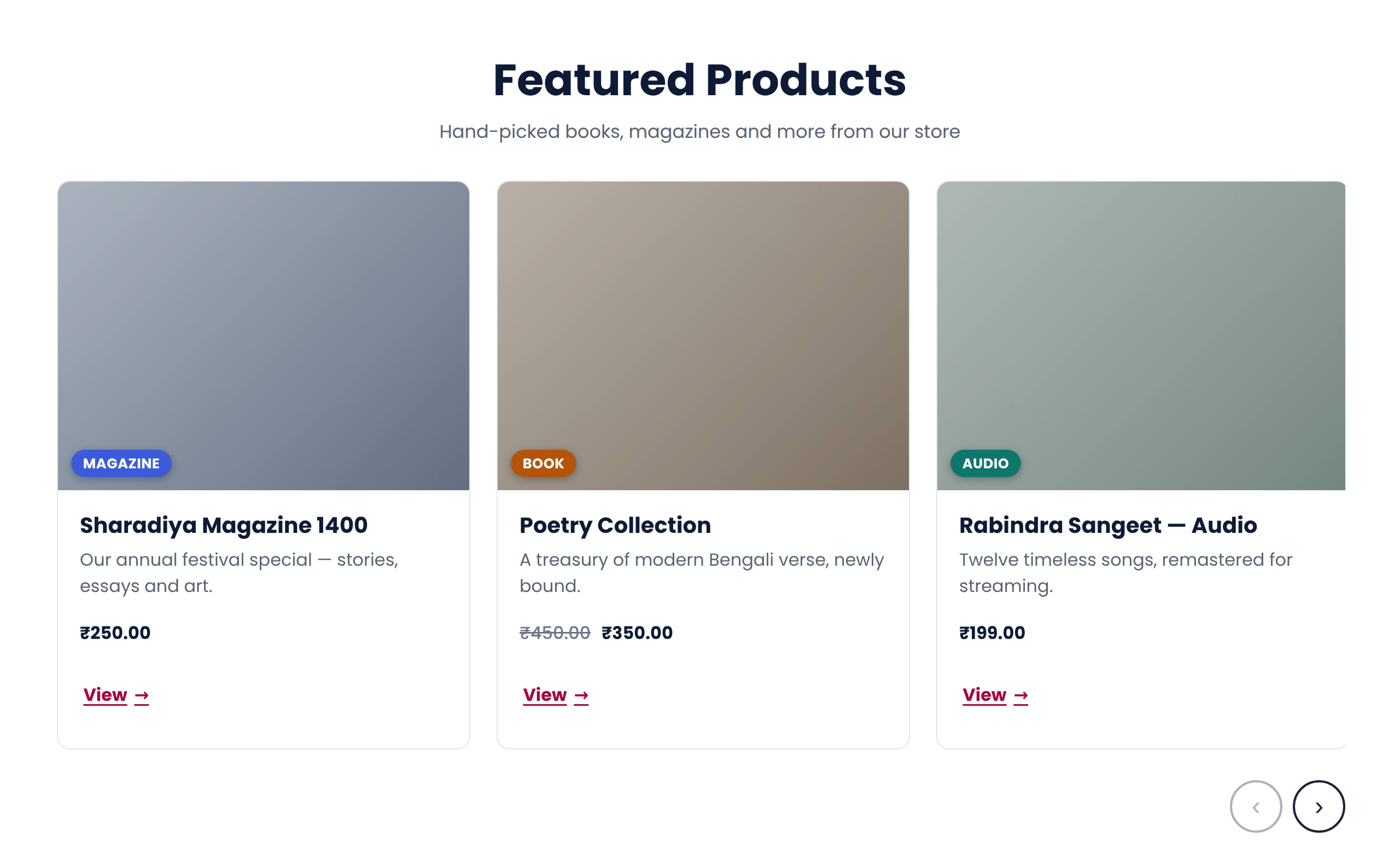
WooCommerce "Featured products" shown in the accessible card scroller: each product is a card with its image, a contrast-checked category badge, the title, the price and a "View" link — keyboard- and screen-reader-friendly.
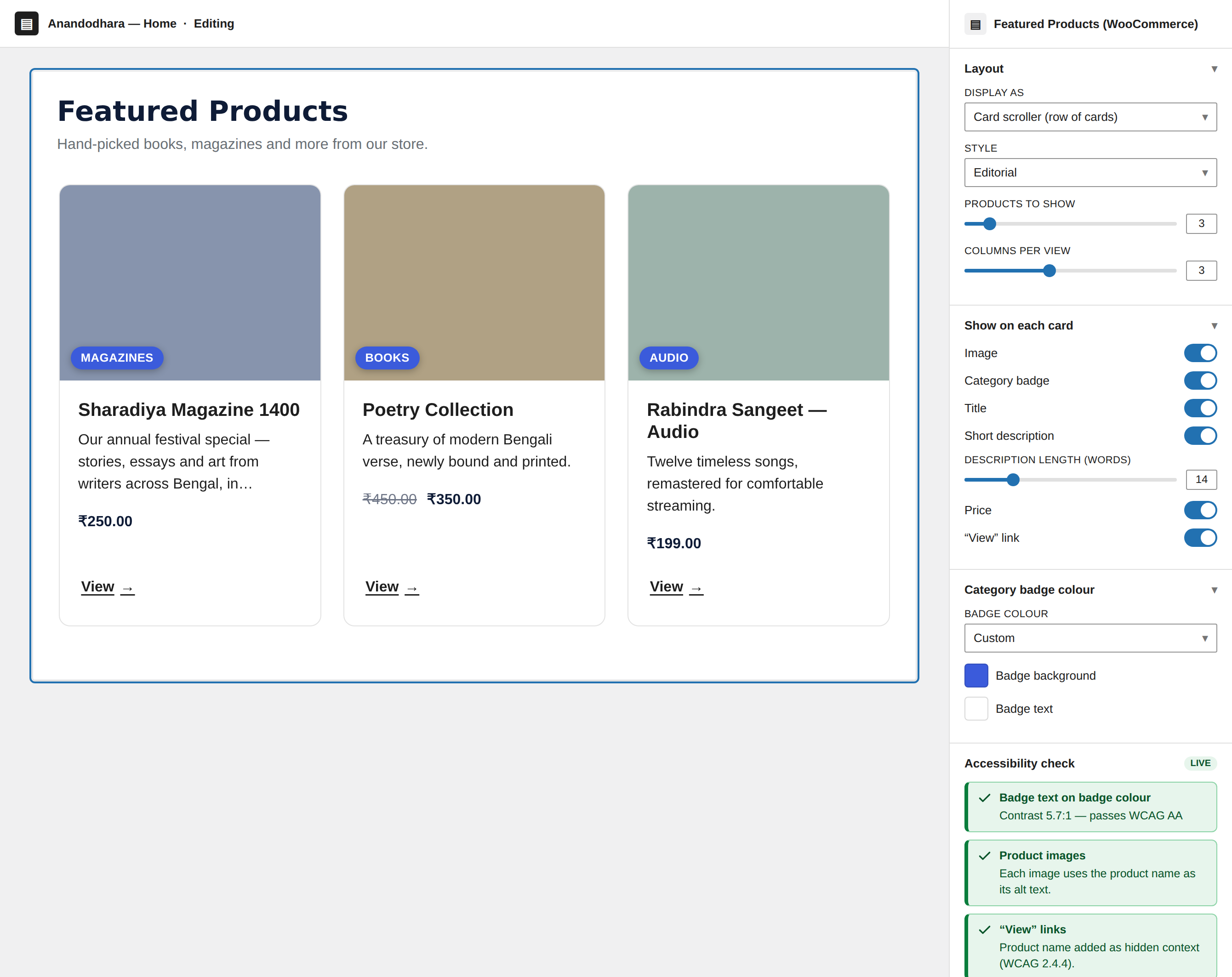
The Featured Products block in the editor: the sidebar's per-element toggles, description length limit and badge colour, with the live Accessibility check reading "Contrast 5.7:1 — passes WCAG AA" for a custom badge colour.
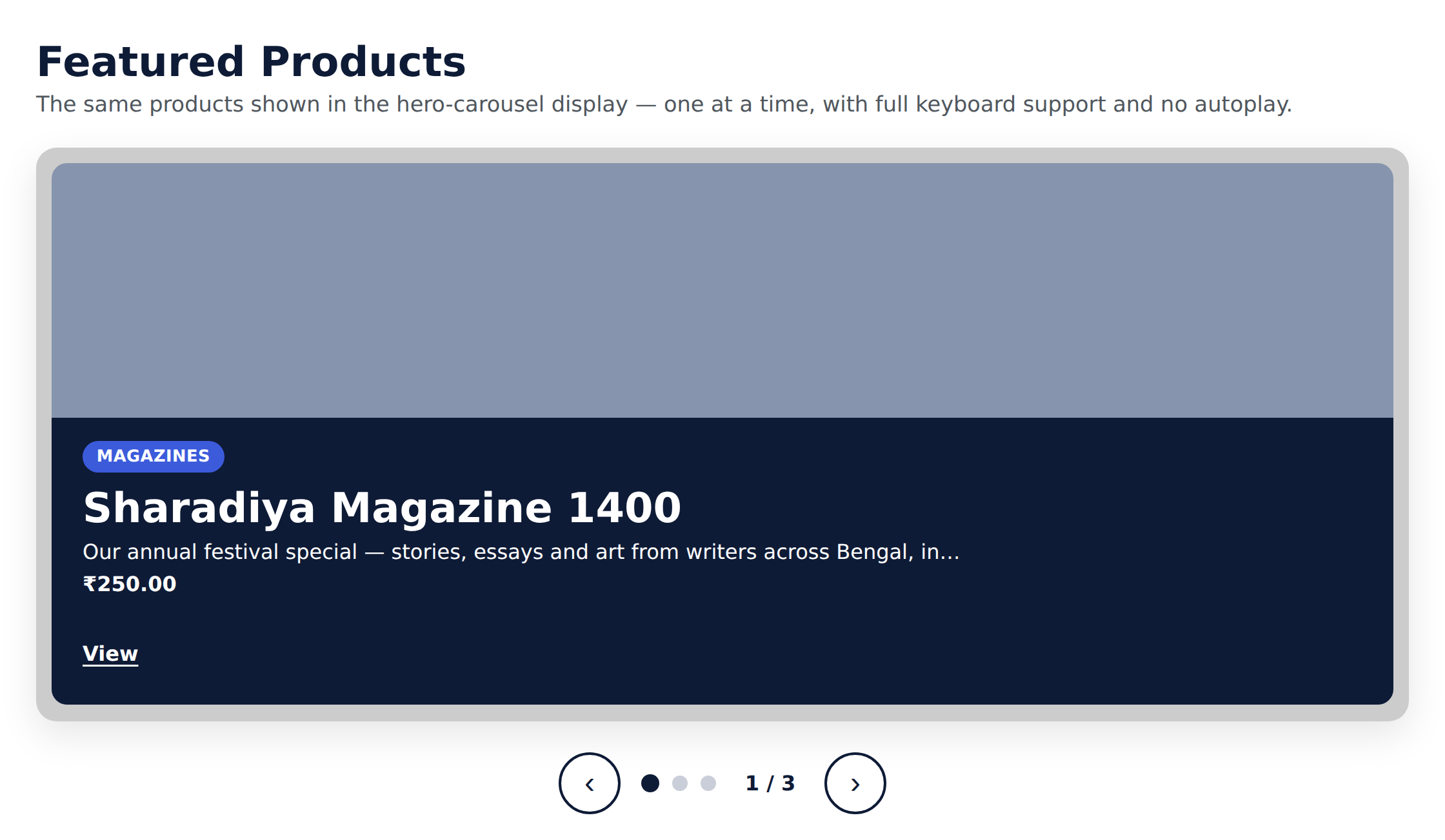
The same Featured products shown in the hero-carousel display — one product per slide, with a category badge, price and "View" link over a solid contrast box, plus dots and previous/next controls. Autoplay is off, so there is no motion.