BACK TO DIRECTORY
Responsive Preview adds a link to the WordPress admin toolbar that opens your site inside a full-screen preview interface. Switch between device viewport sizes and use the Responsive Walk feature to animate a smooth sweep from 1440px down to 320px.
Features
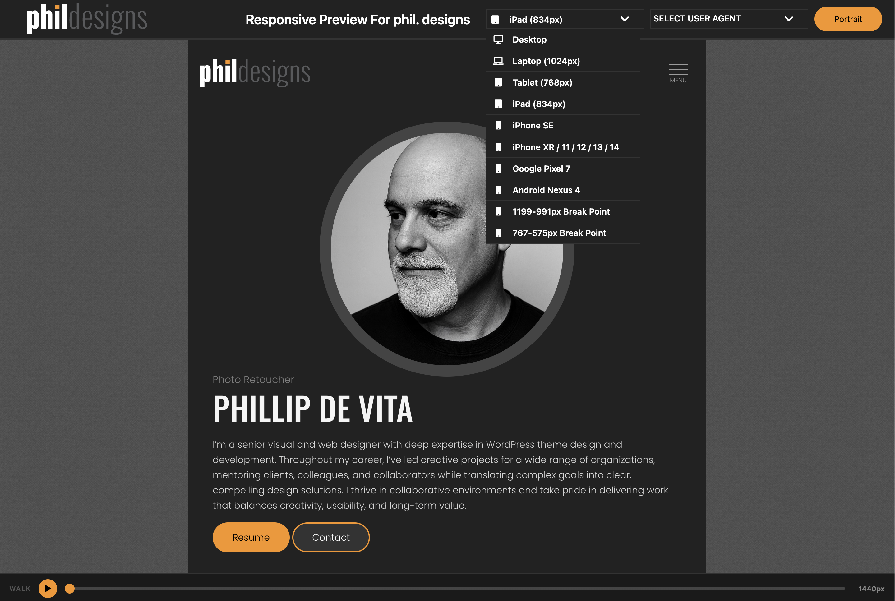
- Device Viewports — desktop, laptops, iPad, iPhones, Pixel, and more; toggle portrait/landscape on rotatable devices
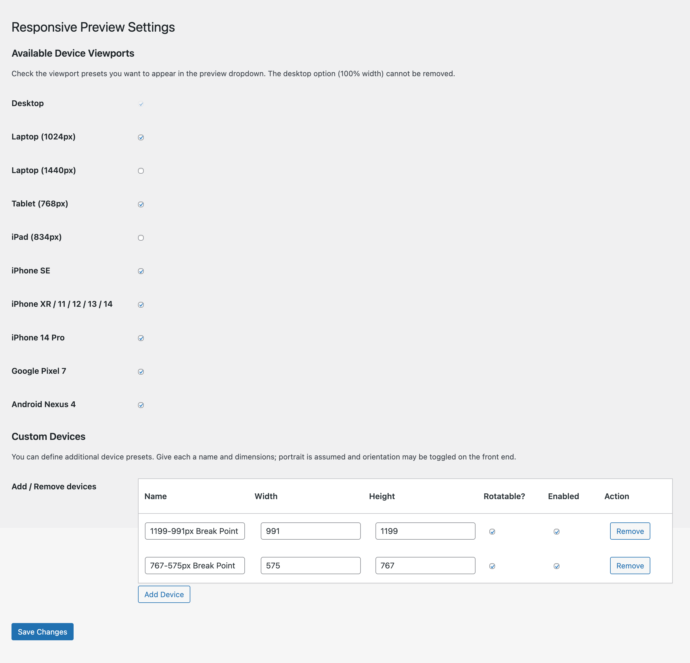
- Custom Devices — define your own device presets with a name, width, and height; manage them from the settings page
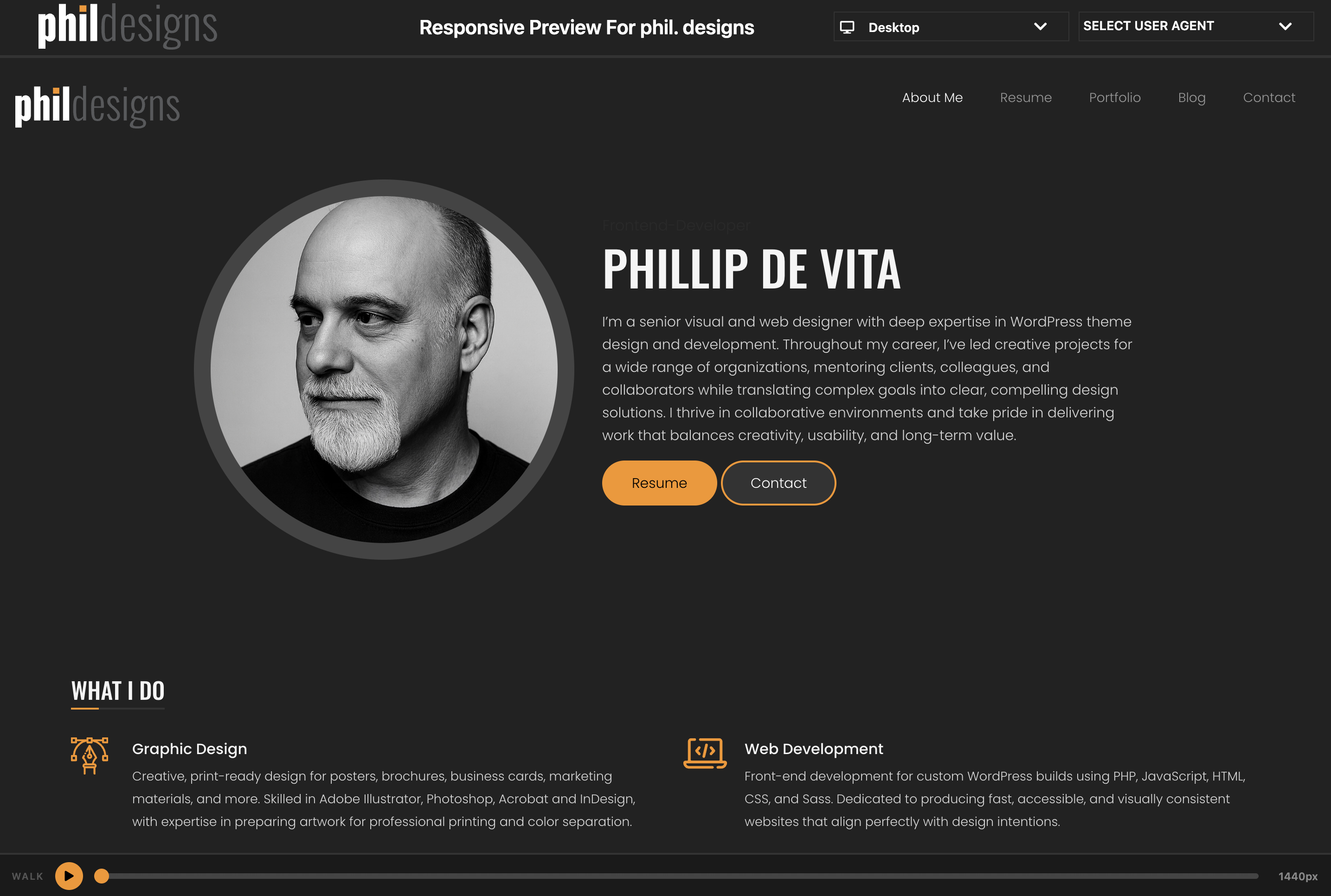
- Responsive Walk — play/pause animation that sweeps the iframe from 1440px to 320px over 10 seconds, with a scrubbable progress bar
- Settings page — enable or disable any viewport from the device dropdown
Usage
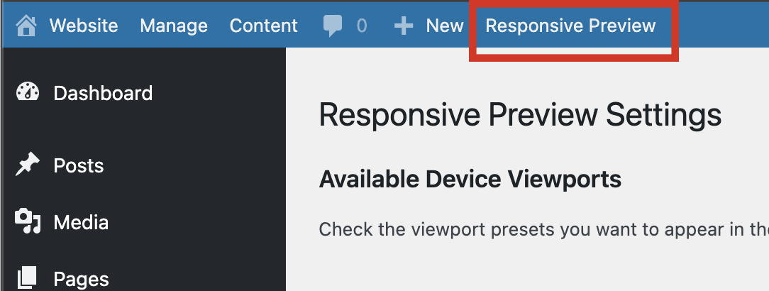
- After activation, click Responsive Preview in the admin toolbar (top bar).
- A new window opens with your site in the preview frame.
- Use the SELECT VIEWPORT dropdown to switch device sizes.
- Click the orange play button at the bottom to start a Responsive Walk.
Screenshots
The preview interface showing the admin toolbar link, device selector, and an iPhone-sized viewport.
The Responsive Walk bar at the bottom showing the play button and progress scrubber.
The settings page with viewport toggles and the custom devices table.
Plugin Details
Active Installs
0Total Downloads
106Version
3.1.1Requires WP
6.7Requires PHP
7.4Tested Up To
7.0.4Added
2026-08-17Last Updated
2026-08-17 1:48pm GMTRatings
5
0
4
0
3
0
2
0
1
0