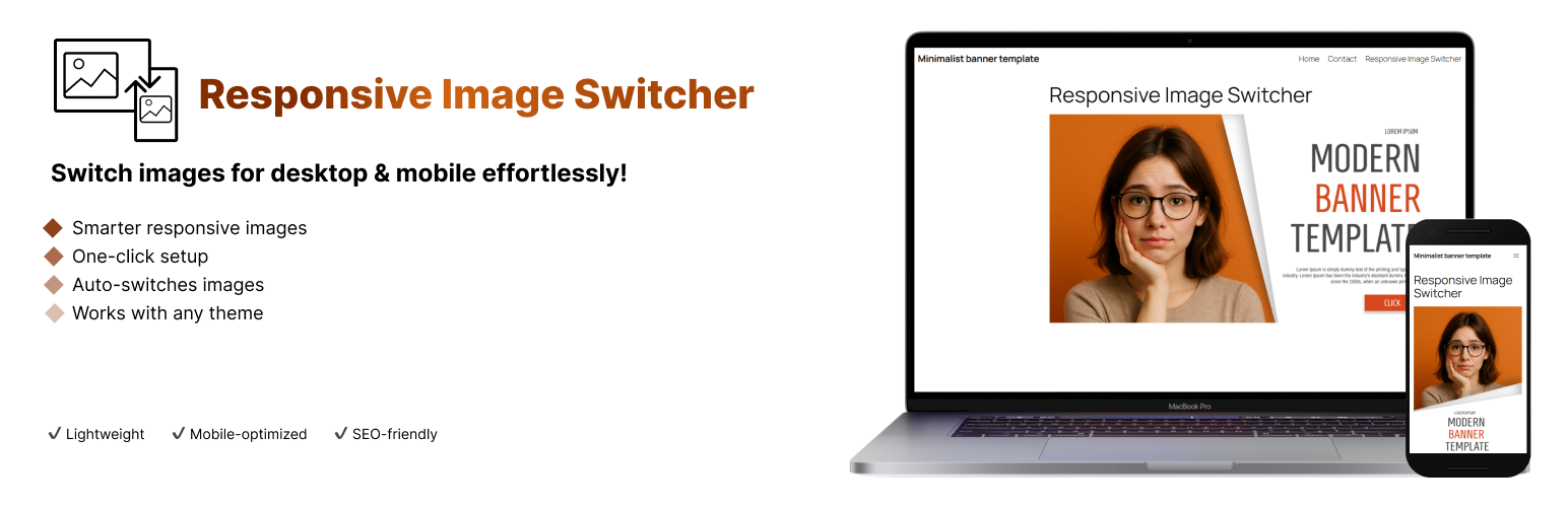
Responsive Image Switcher is a lightweight Gutenberg block that simplifies responsive image management in WordPress. Add the block, upload a desktop image (for screens ≥768px) and a mobile-optimized image (for screens <767px), and the plugin generates clean HTML5 <picture> markup. The browser automatically loads the appropriate image based on screen width, ensuring fast load times and an optimal user experience.
Key Features:
– Device-Specific Images: Show different images on desktop (≥768px) and mobile (<767px)
– Lightweight Solution: Uses standard HTML5 <picture> tags without extra JavaScript
– Better Performance: Optimized for Core Web Vitals by reducing unnecessary image loading
– SEO Friendly: Improves mobile user experience and page speed
– Simple Interface: Easy-to-use block controls in the Gutenberg editor
Why Choose Responsive Image Switcher?
With over 60% of web traffic coming from mobile devices, delivering the right image for each screen size is critical. This plugin eliminates the need for complex CSS media queries or CDN setups, making responsive images accessible to everyone.
Screenshots

The block interface in Gutenberg editor showing desktop and mobile image upload options

Example of responsive images working on desktop and mobile devices